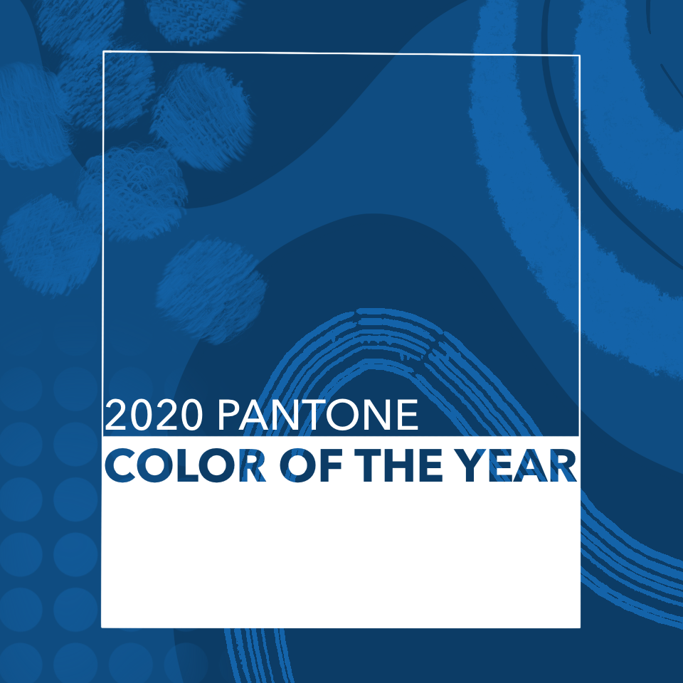
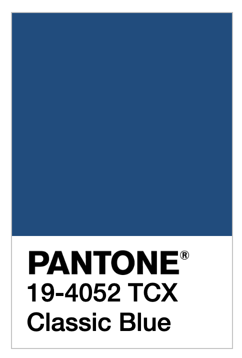
Reminiscent of the evening sky, Classic Blue offers asylum from the hustle, haste, and angst of the era we’re about to leave behind. Pantone, the authority on color for the last 20 years, presents the 2020 Color of the Year and to us, it feels like a personal invitation to zen out.
With a callback to simpler times, Classic Blue invites us to return to a mind-place before the storm. Before cancel culture, cyberbullying, and before family dinners translated to political fights to the death.
Why we need Classic Blue
In their blog post about the announcement, Pantone calls the color “a timeless and enduring blue hue.” Classis Blue challenges the ambiance of today and “highlights our desire for a dependable and stable foundation on which to build as we cross the threshold into a new era.” In a time of turmoil, Pantone offers a grounding, dependable color to ring in a new decade. Leatrice Eiseman, executive director of the Pantone color institute suggests the choice was, in part, a way to bring a sense of reliability and dependability to a time where those pleasures are scarce.
The psychology of blue
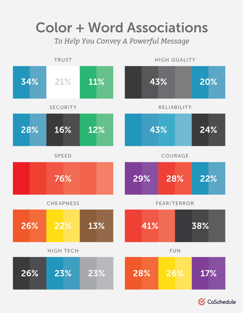
Blue has long been known to inspire peace and serenity. Colors drawn from the ocean and sky encourage us to slow our breathing and relax. Well-known brands often choose blue for marketing campaigns because of its’ link to feelings of security and dependability. Psychology says we lean toward blue because it feels like the safe, trusted choice. CoSchedule’s guide to color psychology suggests this may be why it’s one of the most well-liked colors in the world.
The Color of the Year
Aside from the psychological context, the choice of Classic Blue is partially a result of its’ growing popularity across a breadth of industries all over the world. However, picking the color is usually a year-long task taking into consideration much more than what’s popular in the design sphere. During the research phase, color experts at Panton seek out inspiration from up-and-coming artists, pop-culture, scenic elements from popular travel destinations, technology, the modern social-economic climate, and much more.
Ever since Cerulean Blue in 2010, the Pantone Color of the Year has become an aesthetic touchstone in the design world, informing purchasing and product development choices.
How to use the Color of the Year
Blue is always great for a pop of color in a neutral palette. If you’re staging an event, make a statement with one large piece of furniture in Classic Blue. Accent walls, pillows, blankets, and throw rugs are also great ways to throw in some color fun while staying on-trend. Get daring with som retro velour curtains for a throwback to classic glam.
:max_bytes(150000):strip_icc():format(webp)/__opt__aboutcom__coeus__resources__content_migration__brides__public__brides-services__production__2017__11__29__5a1efbbb71cf134481a097be_jessie-willcox-and-davan-firinn-wedding20171003_17-88cf3e758cf24314b7c093c542a49637.jpg)
Use the Color of the Year in your lighting design. Add it to your table settings with Classic Blue napkins, add pops of blues into florals or wrap them in some blue satin. Maybe we’ll even see the rich, blue eyeliner make a comeback!
Want to infuse Classic Blue into your next event?
At TalkingTree Creative, we love using color to create a feeling or emotional reaction from the audience. Reach out to us today to see what kind of magic we can make together!